

融合之美The Beauty of Fusion“大美是隱忍不語,融合間自有方圓之道。”
項目概況Project Overview知白ZHIBAI DESIGN
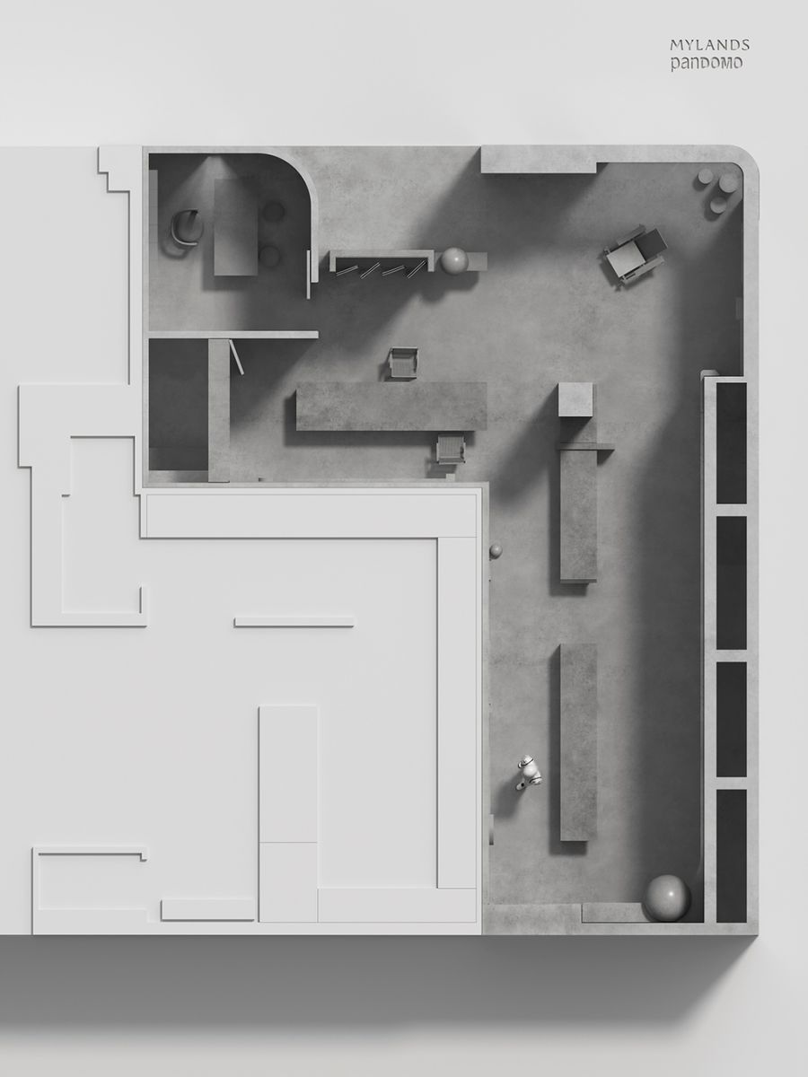
受邀參與艾迪爾家居集團旗下的涂料展廳設計,在一個75平方里的空間里打造一個融合兩個頂級涂料品牌的展廳。Zhibai Design was invited to participate in the design of the paint exhibition hall under the Adier Home Furnishing Group, creating an exhibition hall integrating two top paint brands in a space of 75 square kilometers.
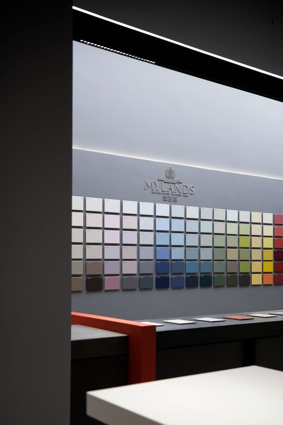
始于1884年創立的MYLAND涂料源自英國倫敦,超過130年的MYLAND是最古老的涂料制造者,也是英國擁有皇室認證的藝術涂料生產者。panDOMO隸屬于德國亞地斯(ARDEX)旗下的以特種水泥基材為主的全新室內裝飾墻地面系統,清水鏝料無縫裝飾面材,其特有的質感及所營造出的視覺效果從優詮釋了現代建筑設計理念。MYLAND Paint, founded in 1884, originated from London, England. With more than 130 years of history, MYLAND is the oldest paint manufacturer and an artistic paint producer with royal certification in the UK. panDOMO is a brand new interior decoration wall and floor system mainly based on special cement base material under German ARDEX (ARDEX). Modern architectural design concept.
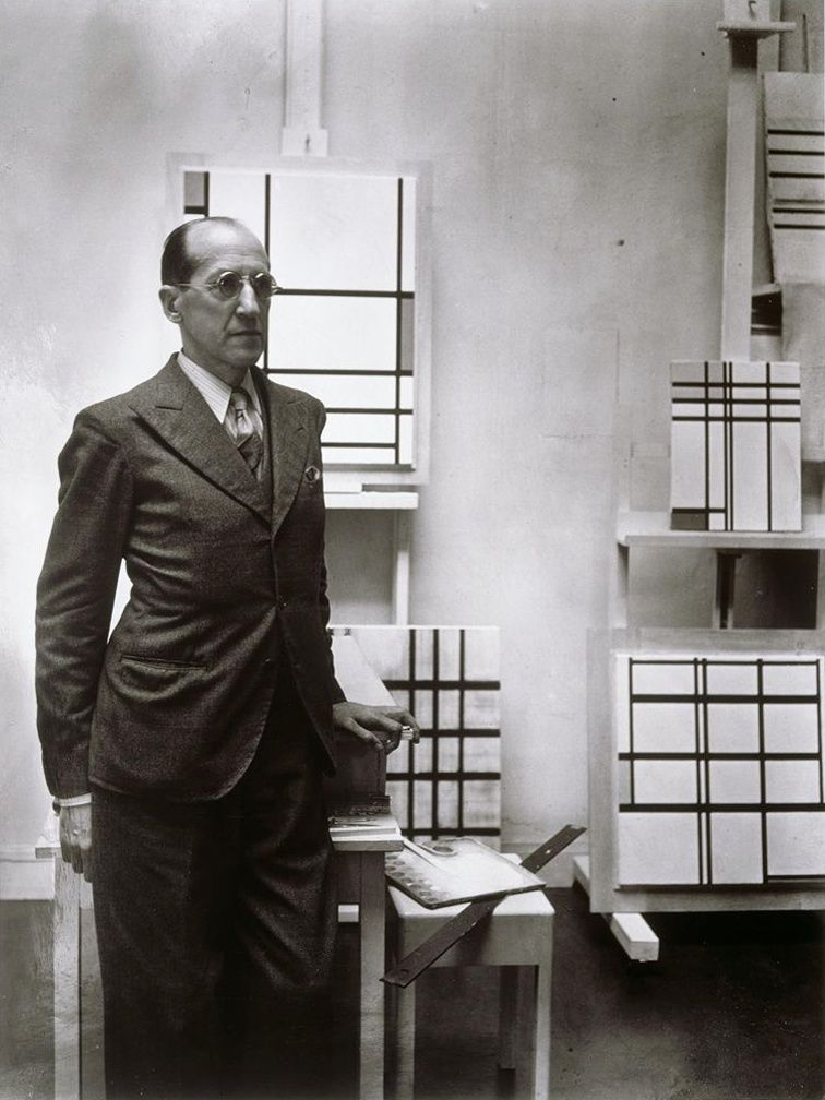
彼埃 · 蒙德里安Piet Cornelies Mondrian(1872-1994)
兩個品牌如何在一個不大的空間實現融合并且保有品牌自身的特點是我們面臨的一個最大挑戰,現代的調性和對經典的致敬是我們對整個空間設計的一個思考方向,如何對經典的再定義是我們的一個表現形式的考驗。How to integrate the two brands in a small space and keep the characteristics of the brand itself is one of the biggest challenges we face. Modern tonality and tribute to the classics are our thinking directions for the design of the entire space. Redefinition is a test of our manifestation.
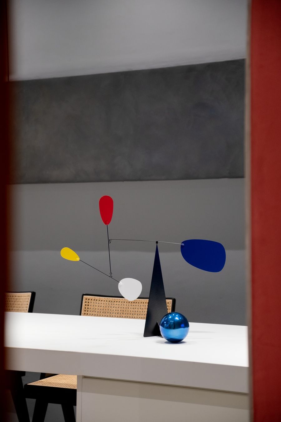
蒙德里安意味著現代主義,他的名字和作品共同詮釋了現代主義者的最高理想,他就是現代主義起源時期的圖騰。Mondrian means modernism. His name and work together interpret the highest ideals of the modernists. He is the totem of the origins of modernism.
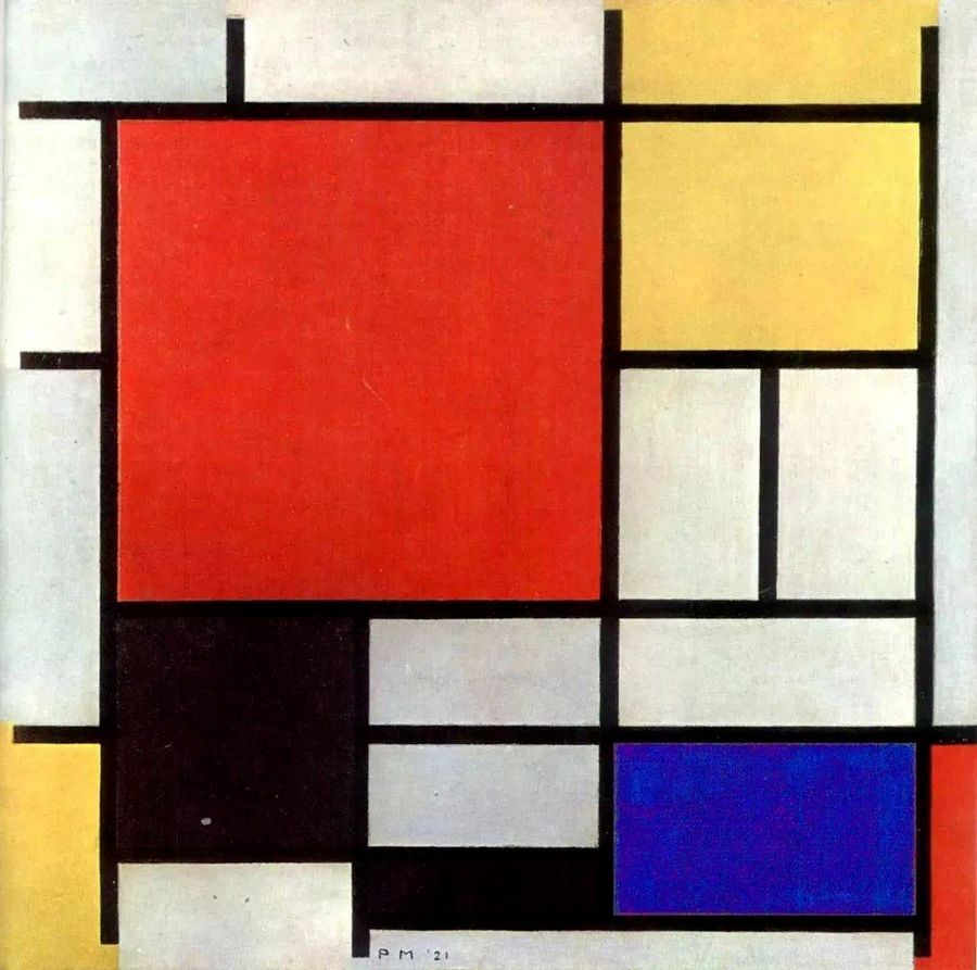
紅黃藍的構成Piet Cornelies Mondrian
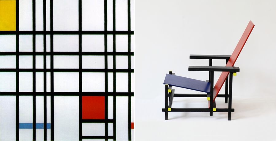
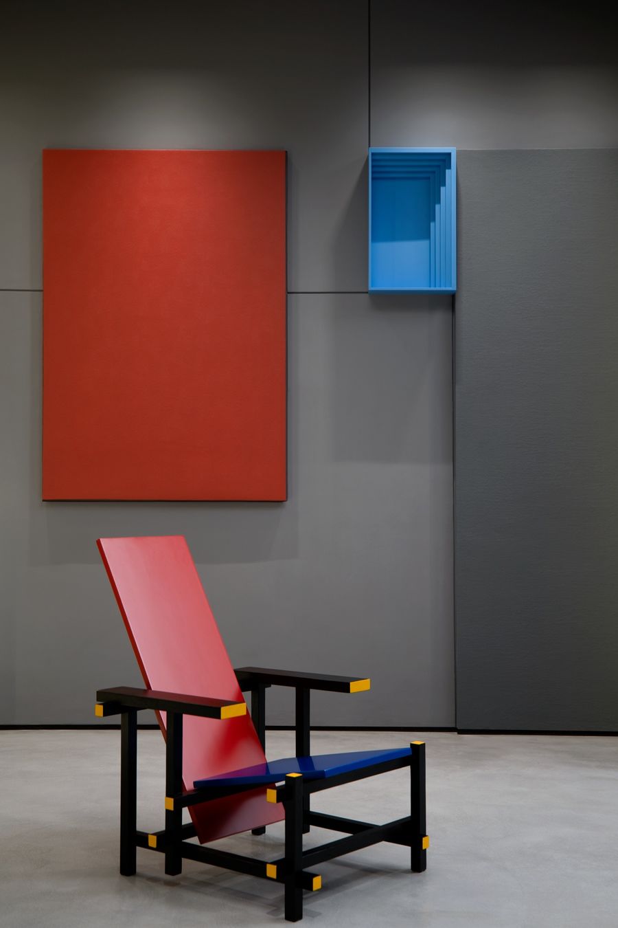
紅黃藍的構成 到 紅黃藍椅Piet Cornelies Mondrian(左) Gerrit Thomas Rietveld(右)
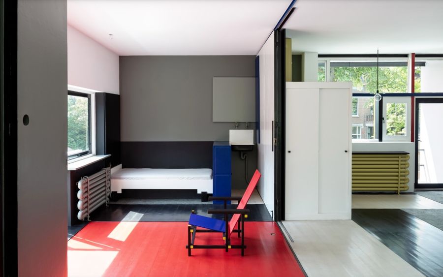
施羅德住宅Gerrit Thomas Rietveld
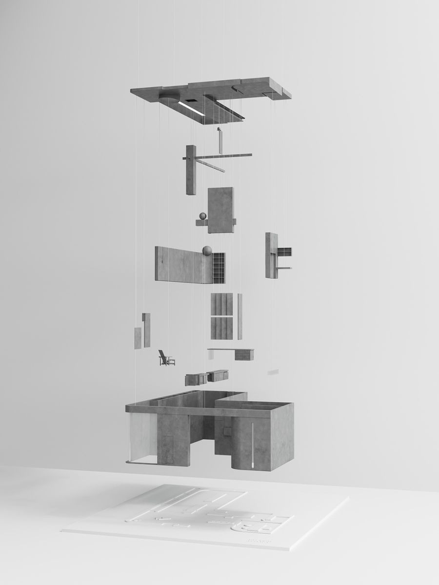
風格派從藝術家到建筑師,蒙德里安以極致的藝術追求,至純至簡的設計風格,不僅啟迪了其后所有現代藝術流派,更深刻影響到繪畫以外,從時裝造型到空間器具的所有設計領域。建筑師里特維爾德將蒙德里安的風格,由二維平面拓展到三維空間。From an artist to an architect, Mondrian, with his ultimate artistic pursuit and pure and simple design style, not only inspired all subsequent modern art schools, but also profoundly influenced everything from fashion modeling to space appliances in addition to painting. design field. Architect Rietveld extended Mondrian's style from a two-dimensional plane to a three-dimensional space.
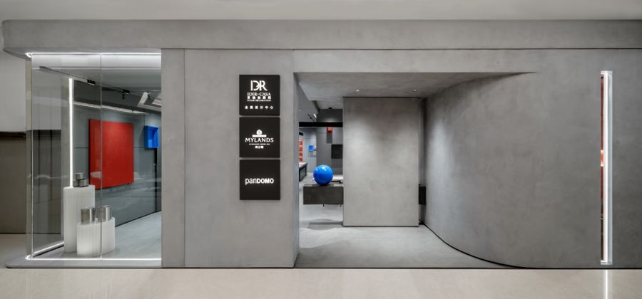
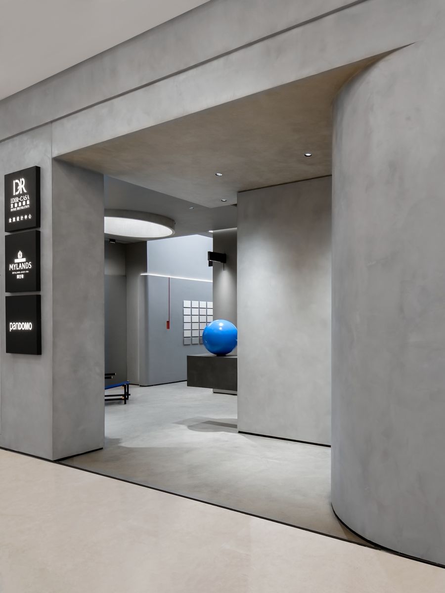
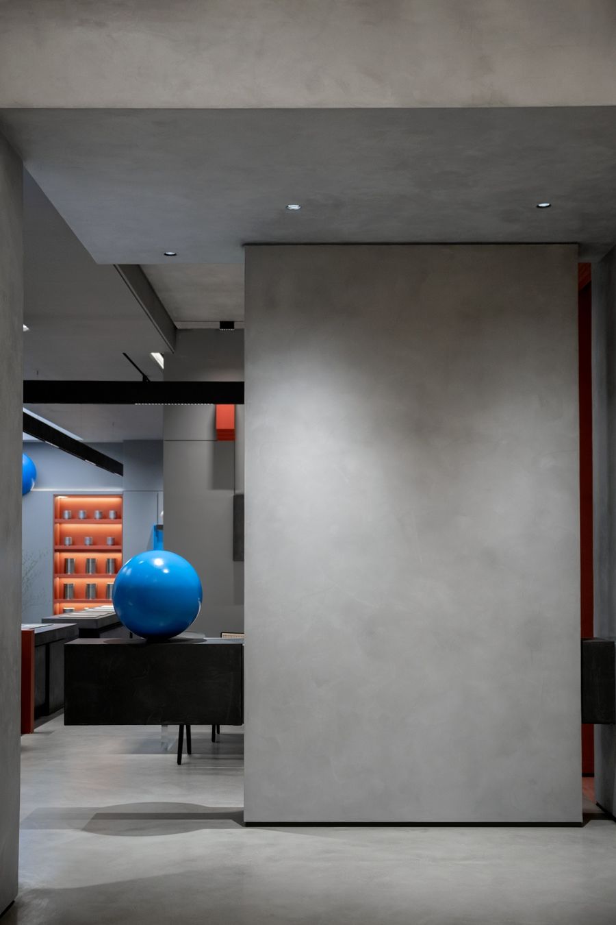
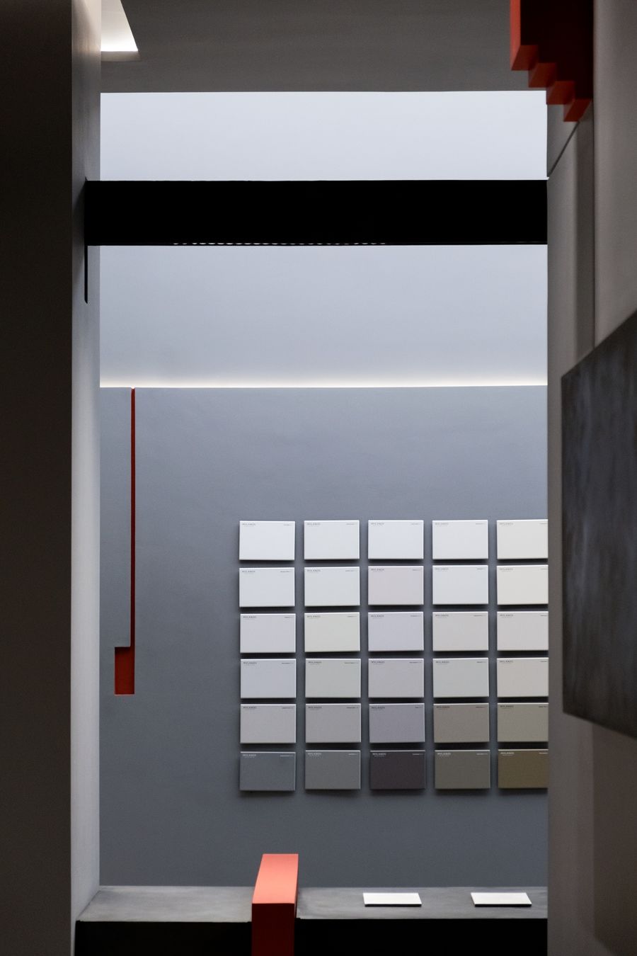
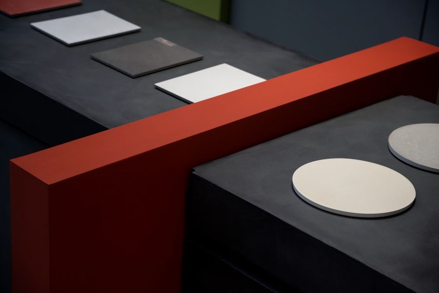
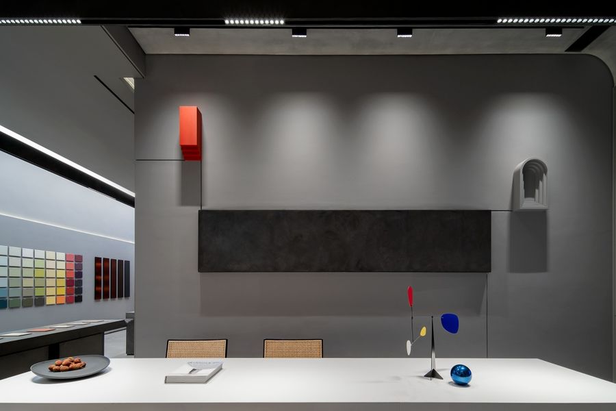
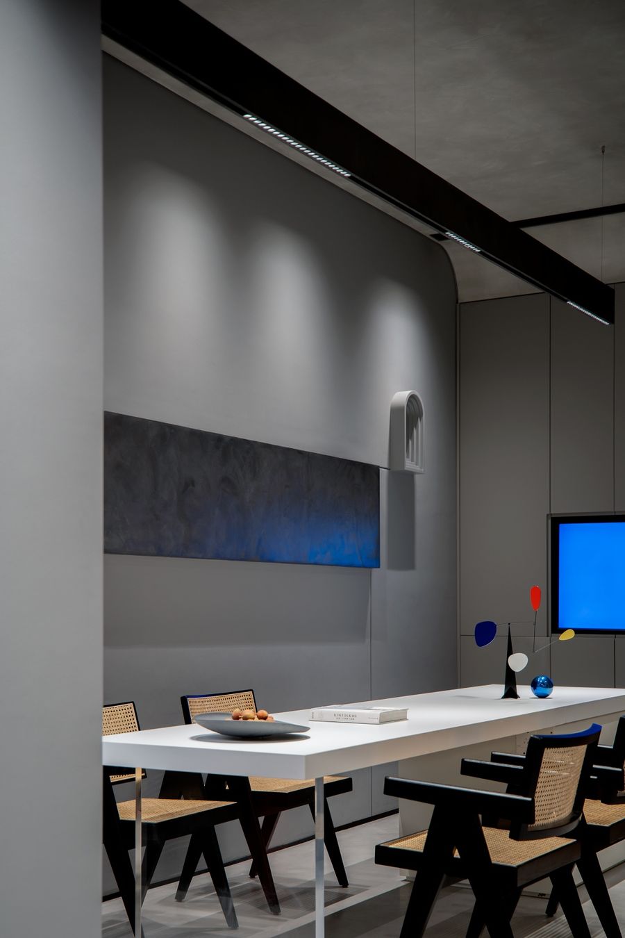
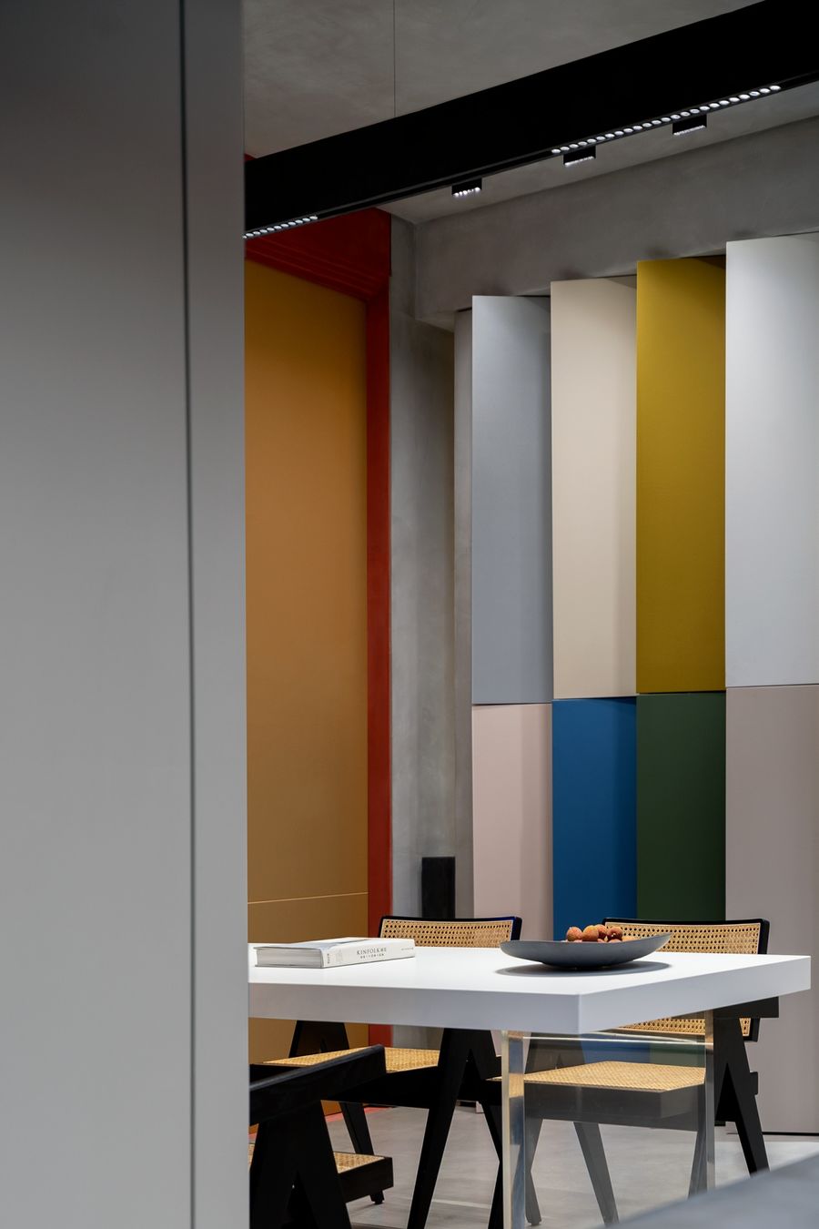
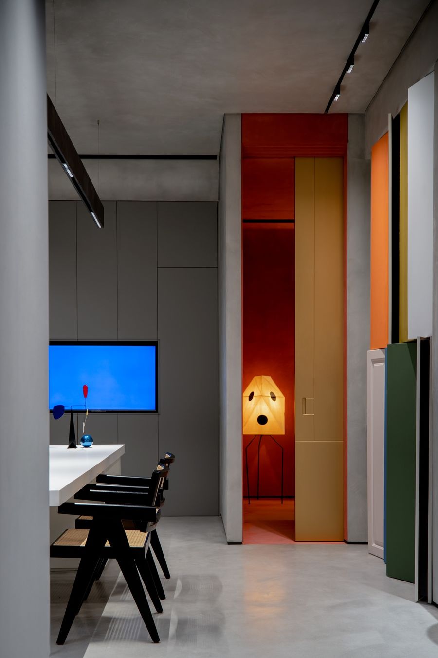
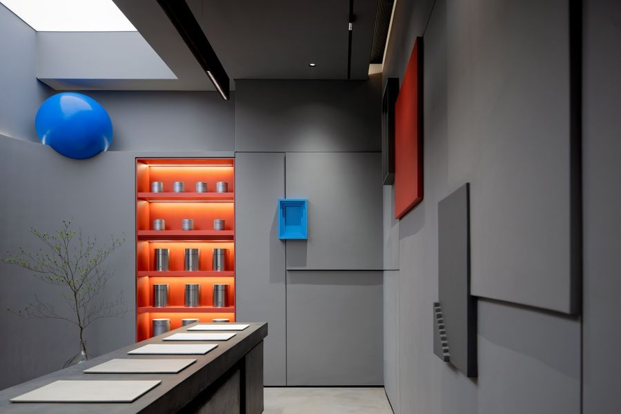
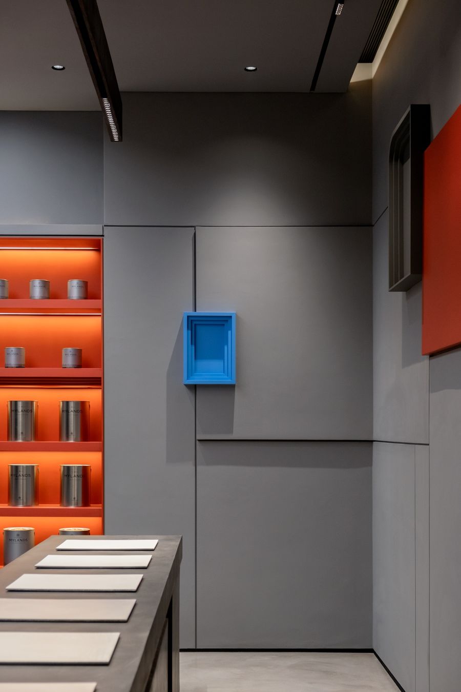
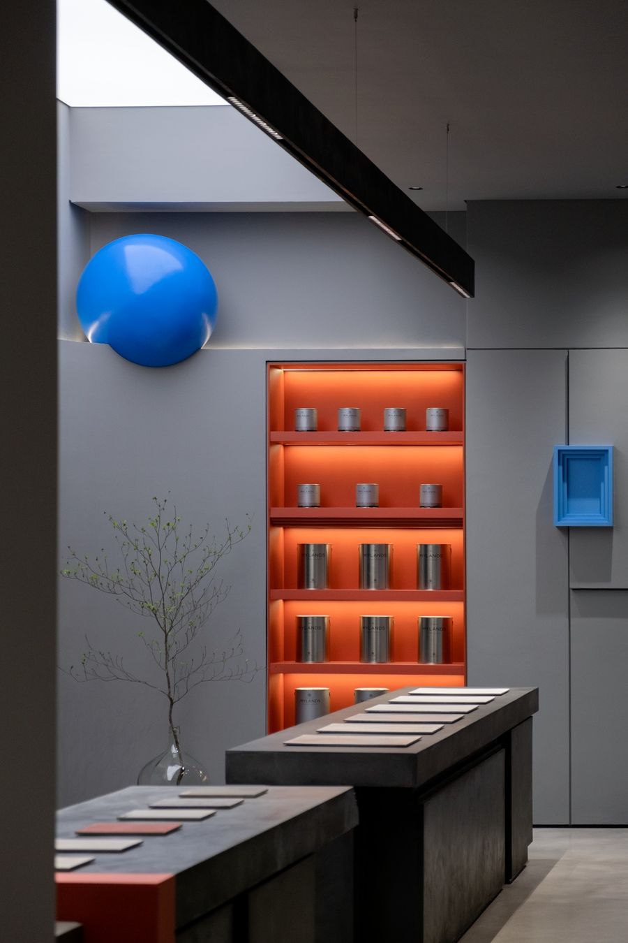
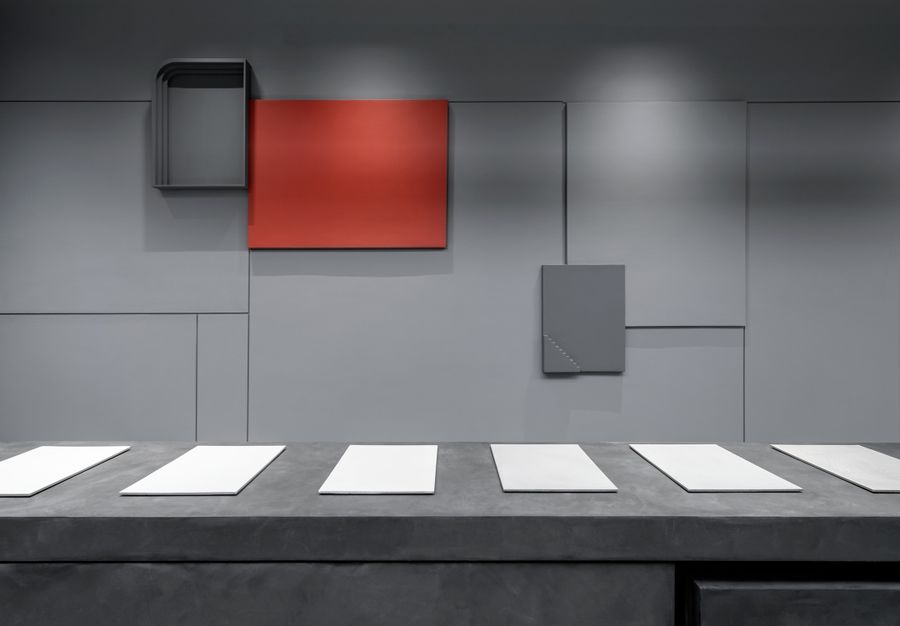
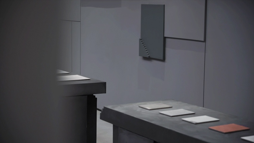
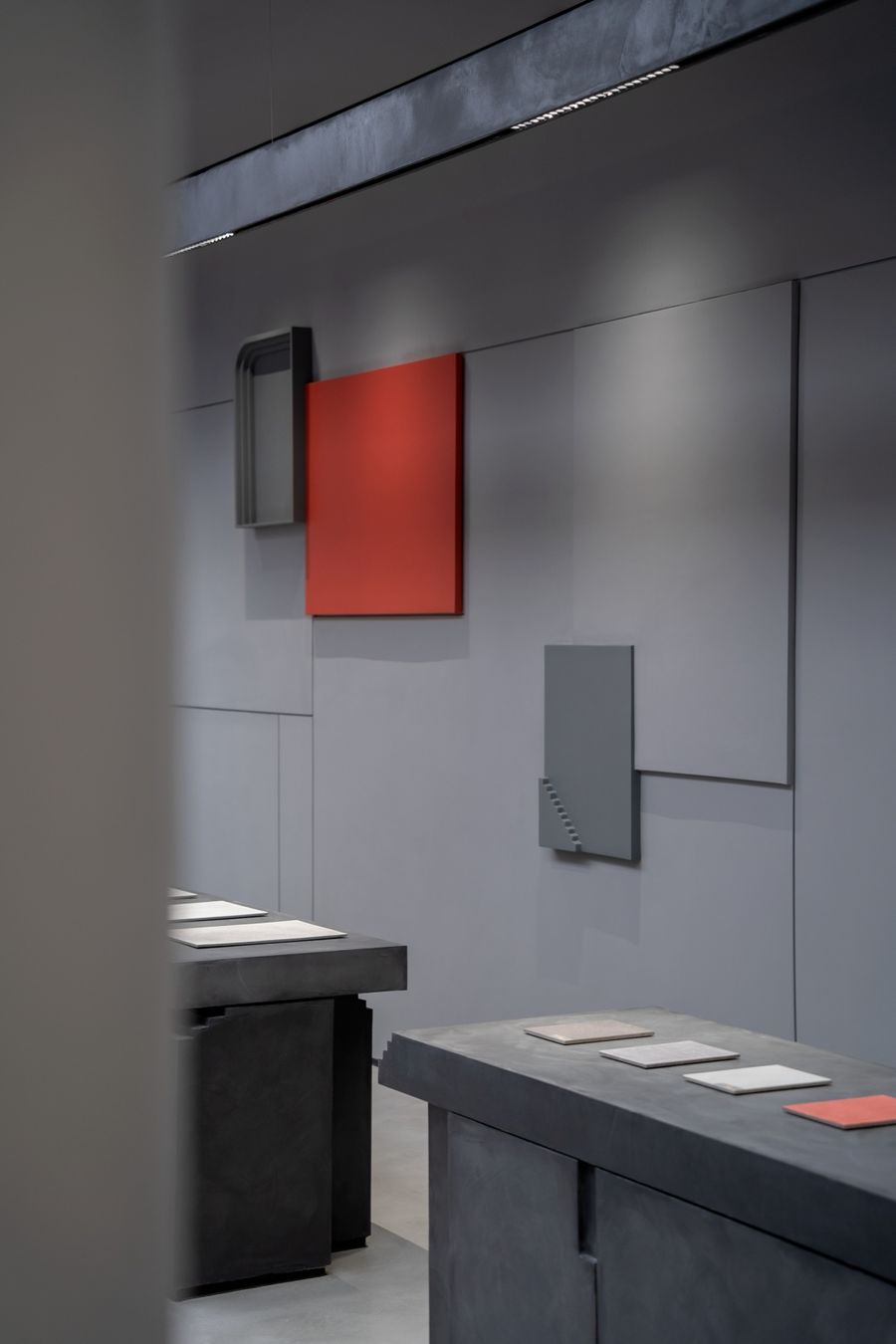
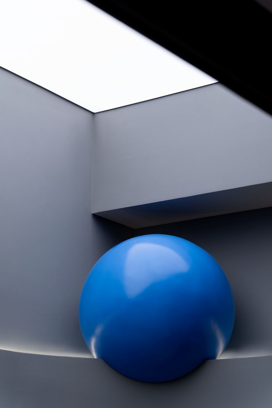
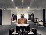
選擇水泥灰作為主要用色,內斂和不張揚,擁有著讓人難以抗拒的高級感和神秘感。舍去繁瑣的設計技巧,空間干凈利落使人安靜,易于思考和創造,維持物質的本色,以此表達空間的務實性。The choice of cement gray as the main color is restrained and unassuming, with an irresistible sense of luxury and mystery. Abandoning the cumbersome design skills, the space is clean and neat, making people quiet, easy to think and create, and maintain the true color of the material, so as to express the pragmatism of the space.
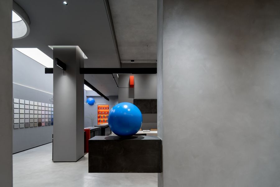
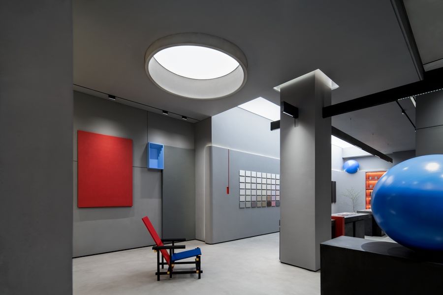
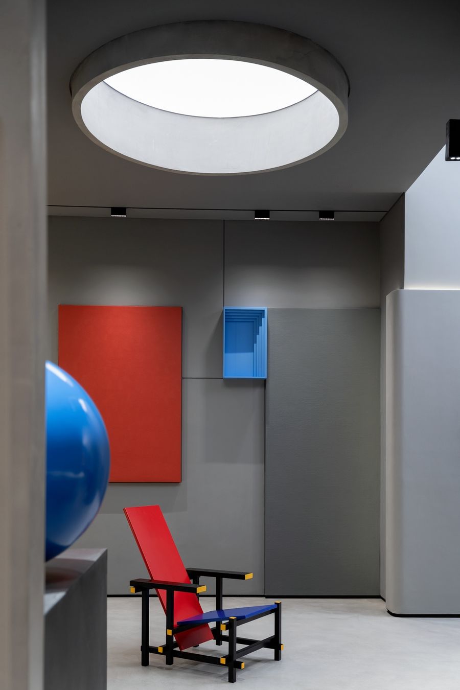
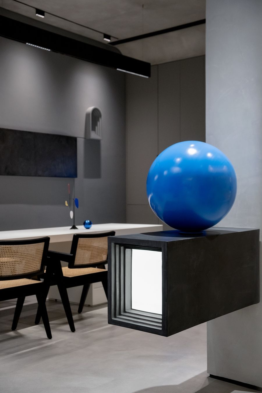
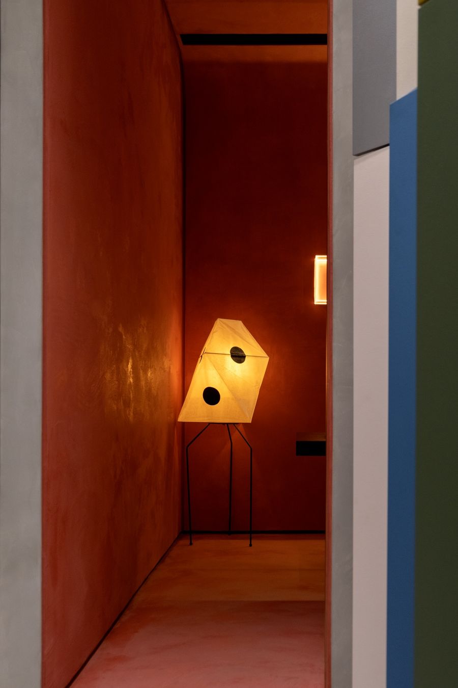
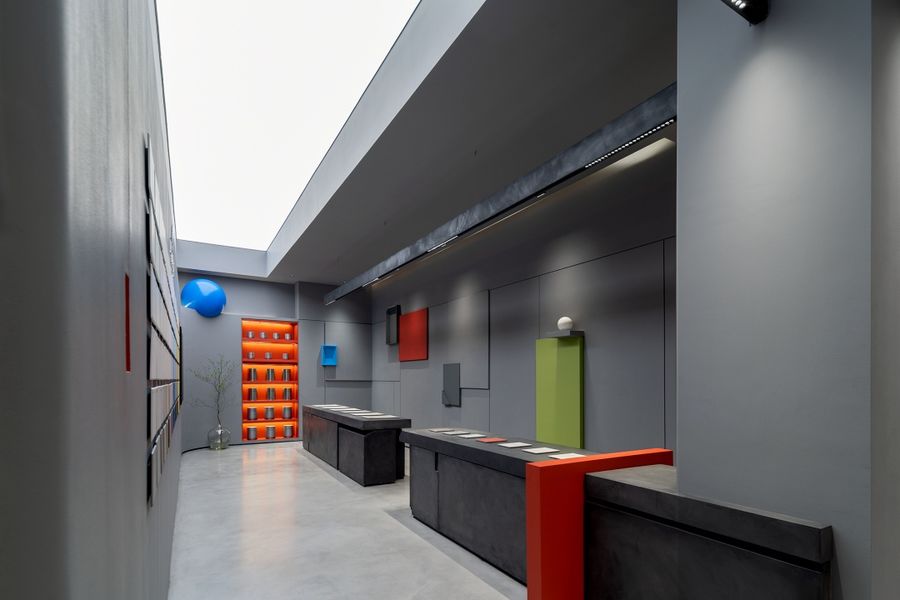
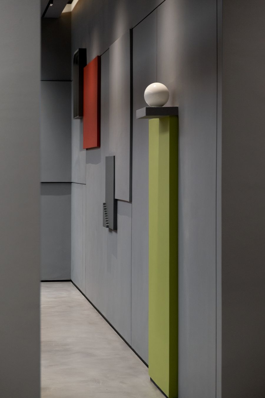
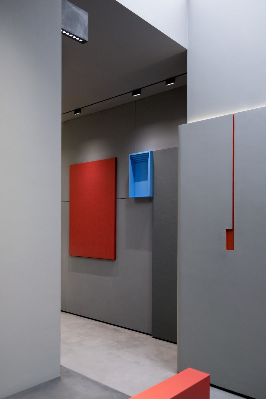
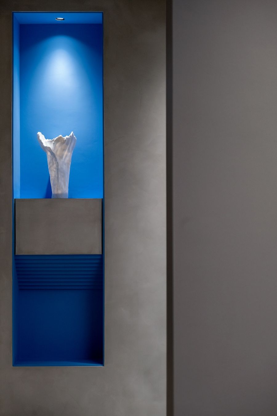
以色調變幻的手法沖擊空間,使用單純明亮的色彩來強化結構,彰顯空間的業態,對展廳空間的藝術性的塑造,擁有獨特氣質的藝術性強的空間,色彩的大塊使用來營造氛圍,還暗示了空間的轉換,家具與空間結構進行巧妙結合,使家具成為空間的延續而非單一的可活動物或障礙物,突出的重點色強化空間的建筑感與個性,制造視覺波動。The space is impacted by the technique of changing tones, and the simple and bright colors are used to strengthen the structure, highlight the format of the space, and shape the artistry of the exhibition hall space. In order to transform the space, the furniture and the space structure are skillfully combined, so that the furniture becomes the continuation of the space rather than a single movable animal or obstacle. The prominent key colors enhance the architectural sense and personality of the space and create visual fluctuations.
簡單明了的幾何形體交錯而成,基礎的色彩對立而又統一,簡約的形式感,形體的完整性。空間以水平和垂直的布置,透明和不透明的材料,空間之間相互聯系,讓展廳簡潔、純化以表現一種永恒價值。Simple and clear geometric shapes are pieced together, the basic colors are opposite and unified, the simple sense of form, and the integrity of the shape. The space is arranged horizontally and vertically, with transparent and opaque materials, and the spaces are interconnected, making the exhibition hall simple and purified to express a timeless value.
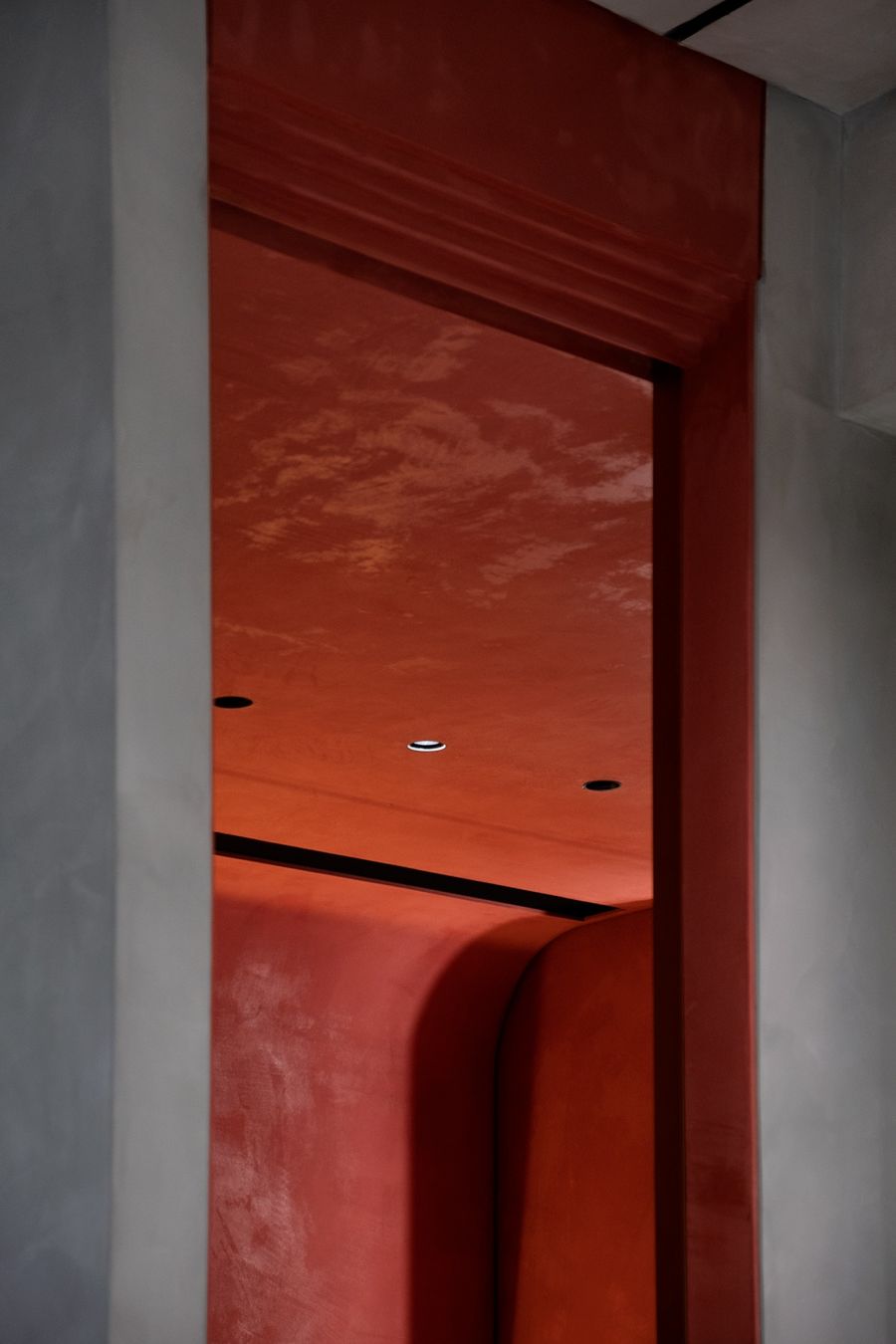
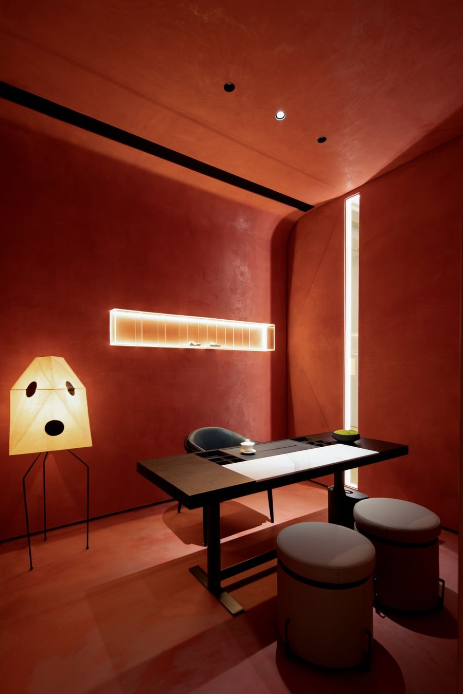
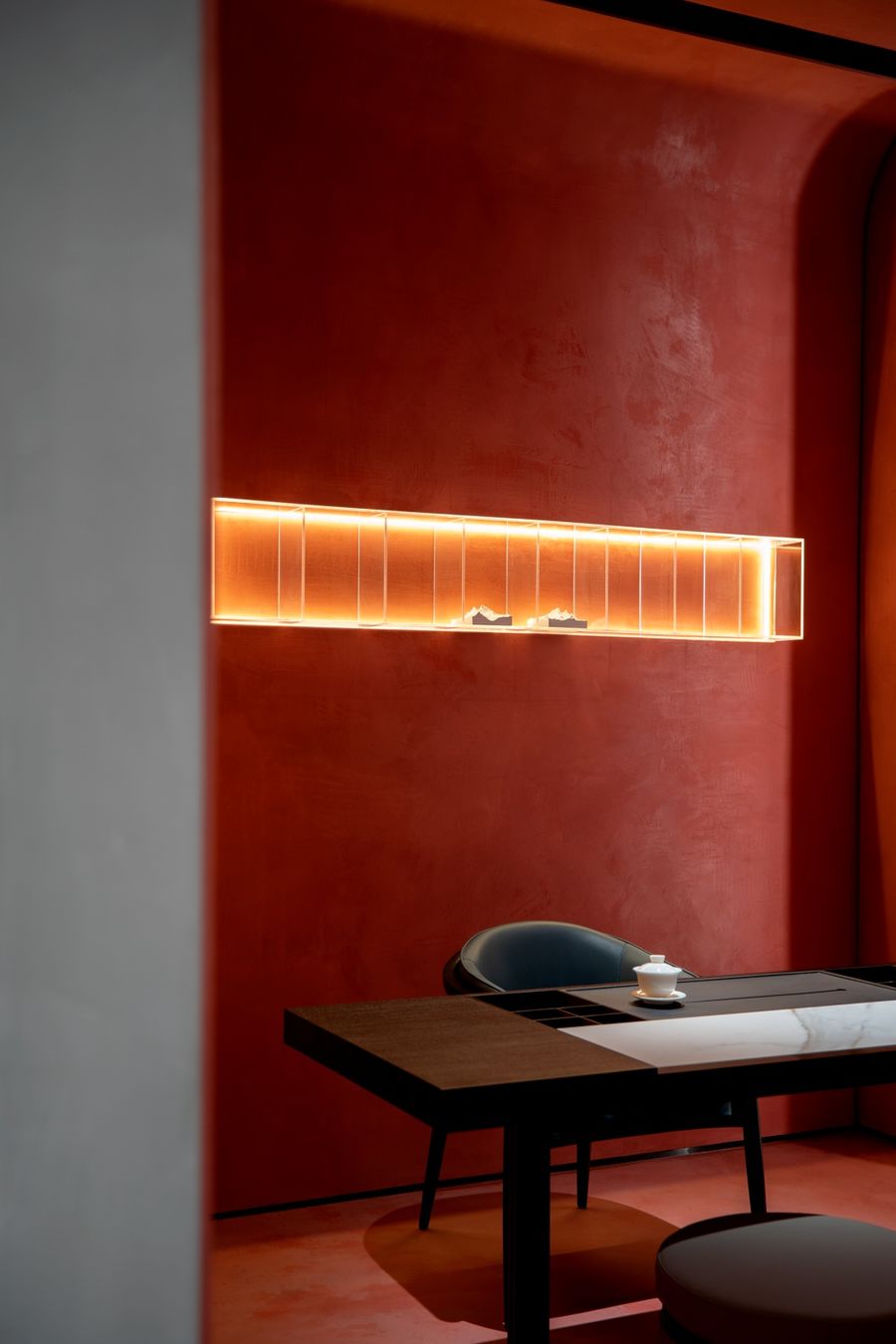
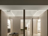
茶室我們用一種更加平和的方式去處理,光影在此營造出靜謐的空間氛圍,讓人們對材質的色彩和質感有了深度的感知。在多重視覺焦點之間維持平衡。墻體的"I"字縫隙,線性的燈光,又為室內增添靈動自如的場域,帶來流動的生機。We use a more peaceful way to deal with the tea room. Light and shadow create a quiet space atmosphere here, so that people have a deep perception of the color and texture of the material. Maintain a balance between multiple visual focal points. The linear lighting adds a flexible and free field to the interior, bringing a flow of vitality.
精密的數理計算,長長短短的線條,將畫面切割成大小不同錯落有致的幾何形體,畫面看上去簡潔,明朗,富有韻律。幾何分割構成上的均衡,直角相交的垂直線以及水平線的處理,非對稱的左右關系。Precise mathematical calculations, long and short lines, cut the picture into geometric shapes of different sizes, and the picture looks simple, clear and full of rhythm. The balance in the composition of geometric divisions, the processing of vertical and horizontal lines intersecting at right angles, and the asymmetric left-right relationship.
墻體的曲線將緊繃的空間疊加虛焦式的柔美感,弧與曲面謙遜而飄逸,連續、流暢、柔美,分離的結構形體,增添的不僅是空間結構張力,更是雕塑般的立體美感,松弛 而豐富的縱深層次,參差百態乃幸福本源……The curve of the wall superimposes the taut space with a soft focus of softness. The arc and the curved surface are humble and elegant, continuous, smooth and soft. The separated structure adds not only the spatial structural tension, but also the sculptural three-dimensional beauty. , relaxation and rich depth, unevenness is the source of happiness...
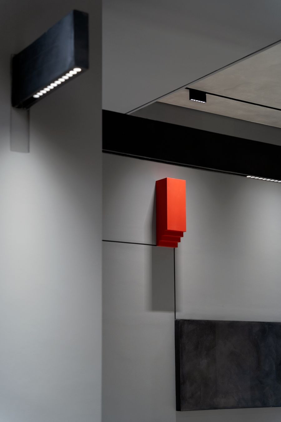
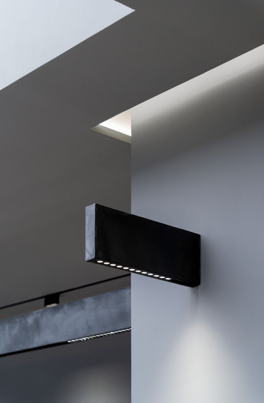
基本的幾何結構單體,各個構件都以線、 面、塊的形式,平滑的塊面,簡潔的體塊,也融合了斯卡帕式的多層疊級元素細節,組合成了空間的細部構造,使空間的開合節奏富于變幻。The curve of the wall superimposes the taut space with a soft focus of softness. The arc and the curved surface are humble and elegant, continuous, smooth and soft. The separated structure adds not only the spatial structural tension, but also the sculptural three-dimensional beauty. , relaxation and rich depth, unevenness is the source of happiness...
項目信息
Information
項目名稱:MYLANDS & panDOMO展廳
Project Name: MYLANDS & panDOMO Showroom
項目地址:長沙喜盈門范城
Project Address: Changsha Xiyingmen Fancheng
建筑面積:75㎡
Building Area: 75㎡
設計時間:2021 .11
Design Time: 2021 .11
完成時間:2022 .3
Completion Time: 2022 .3
空間設計:知白設計研究室
Space Design: Zhibai Design and Research Office
設計團隊:周海飛,王子林,況偉峰
Design Team: Zhou Haifei, Wang Zilin, Kuang Weifeng
施工單位:中昝建筑
Construction Unit: Zhongzan Construction
燈光設計:石客照明
Lighting Design: Shike Lighting
項目攝影:MIN STUDIO
Project Photography: MIN STUDIO


評論(0)