

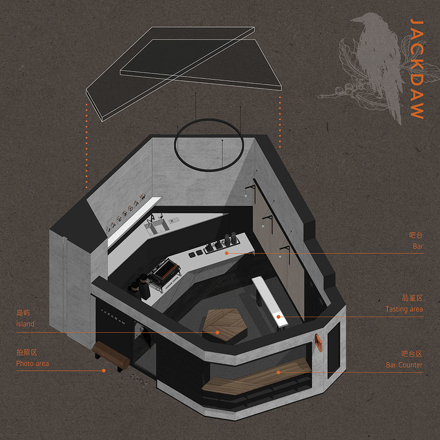
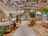
在書店內置入咖啡空間,這一概念已不再新鮮,且仿佛成了約定俗成的組合。本案是墨雀咖啡的二號店,位于半點書店內,在咖啡空間的位置選擇時,設計師有幸參與其中。最終選取了一處多邊形的角落,以書架作半開放式包裹,形態(tài)有如雀鳥在建筑的角落處筑巢,由此展開了“墨雀“棲居于書店內的故事。
The combination of coffee space and bookstore has become a common practice nowadays. Jackdaw Coffee has opened its second shop in Bundim Bookstore, Zhongshan, China, and entrusted SameSame Design(SSD) to conceive its interiors. The coffee shop is set at a polygonal corner, partially enclosed by a bookshelf and unveiling a story-telling scene where a bird builds nest and settles down in a bookstore.
▼項目概覽
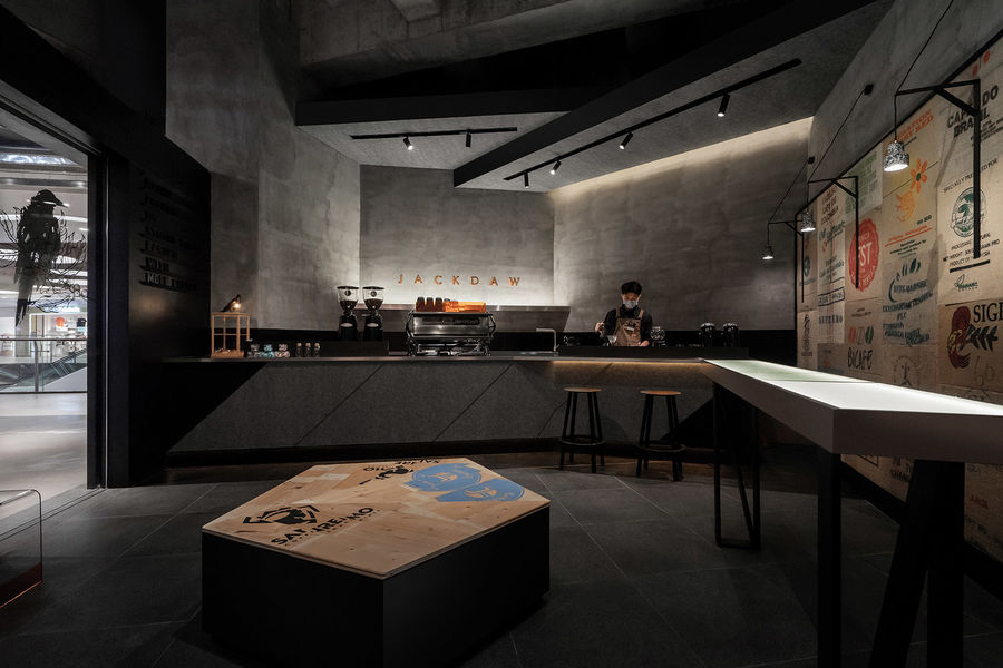
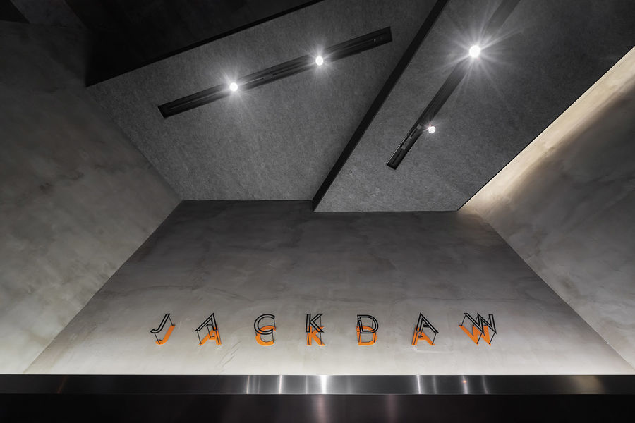
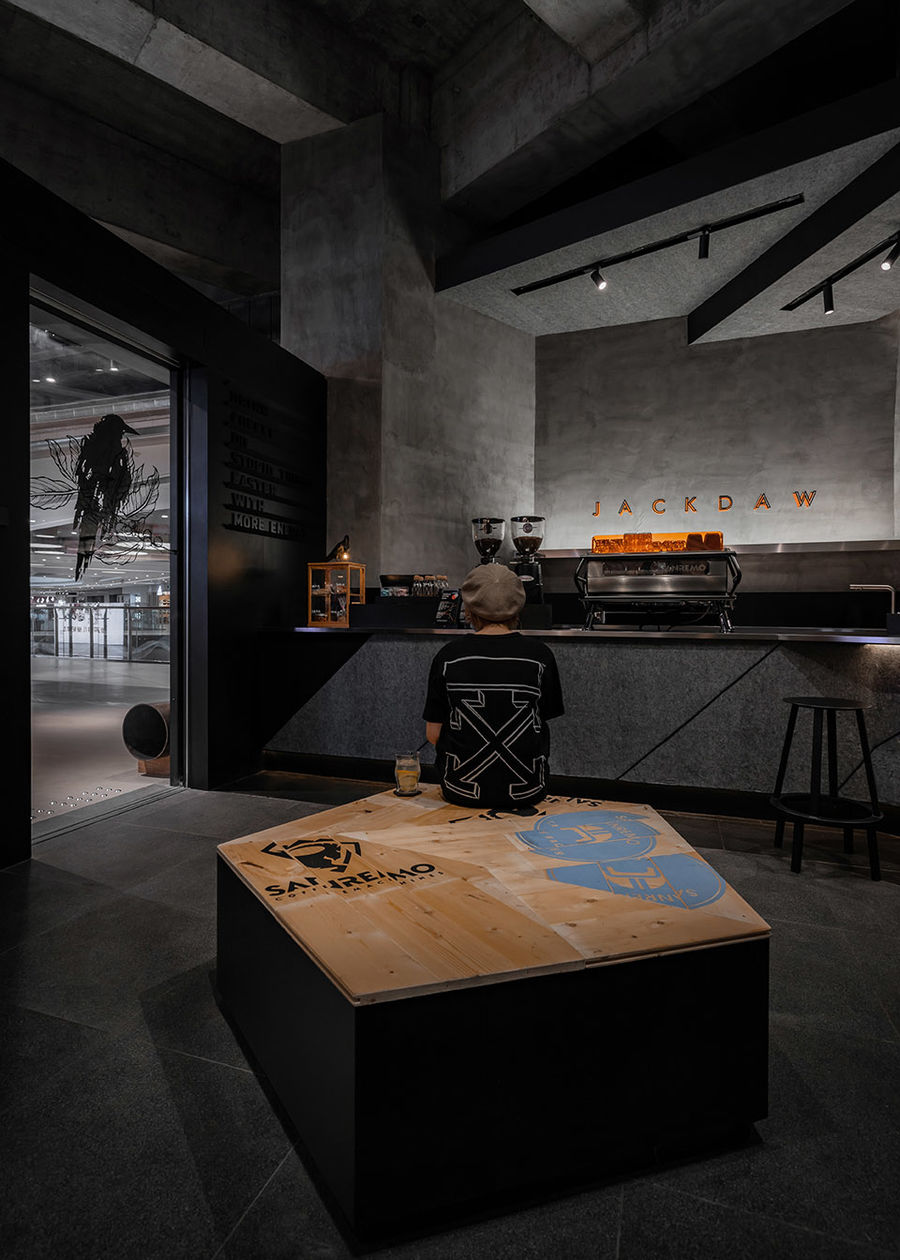
墨雀咖啡希望本店給顧客留下更鮮明的品牌印象和帶來獨特的咖啡體驗。由此,設計創(chuàng)意從最直接的信息出發(fā),則“墨”與“雀”。就像我們了解某人某物,都是從命起名字那一刻開始一樣…墨,在中國的文化里象征著純粹的黑,又自然聯想到知識與文化。設計師以黑色的材料作為畫筆,勾勒空間的輪廓,天花的邊緣、燈槽、地腳線,吧臺造型與擋水線、書柜外框及家具結構。
The client hoped the shop to show an impressive brand image and bring customers unique coffee experiences. In response, the design started from the literal meaning of the brand’s name Jackdaw, the Chinese characters of which are pronounced as Mo(means “ink” ) Que(refers to “bird”). “Mo” in Chinese language means ink, which symbolizes pure black and is often associated with knowledge in Chinese culture. The designers utilized black materials as the paintbrush to outline spatial contours, ceiling edges, lighting grooves, skirtings, the form and water-blocking lines of the bar counter, the frame of book cabinet as well as furniture structures.
▼咖啡空間外觀
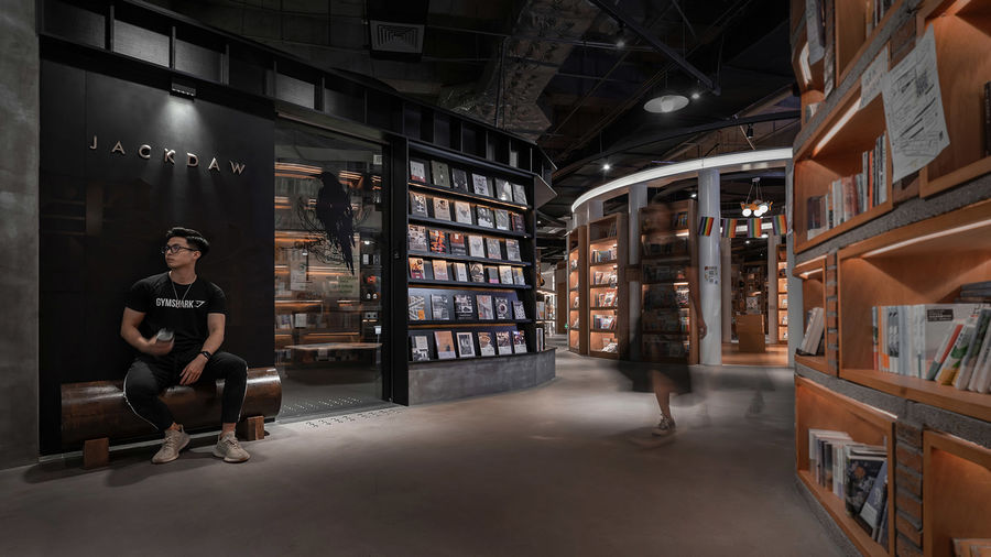
▼只有包裹咖啡空間的書架,由全黑的材料組成

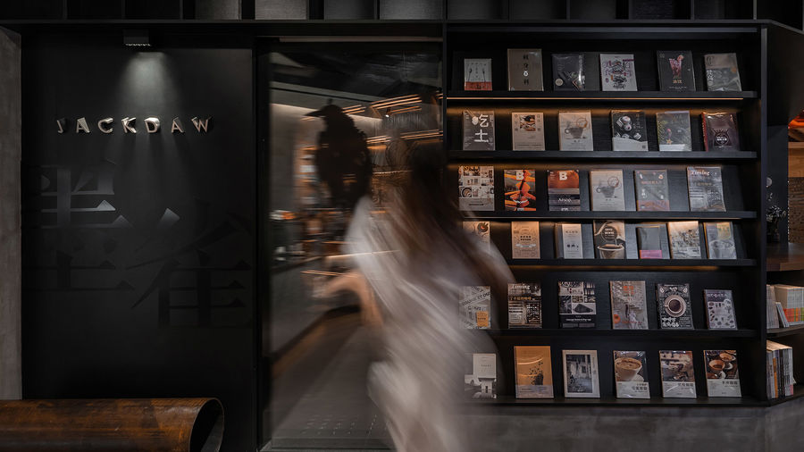
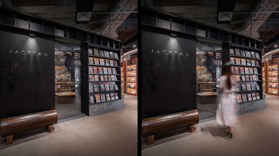
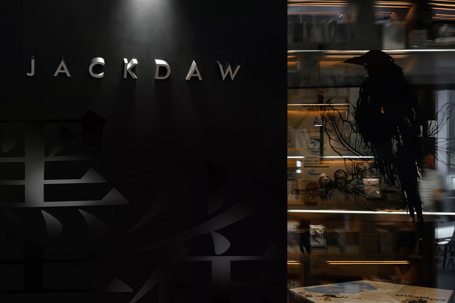
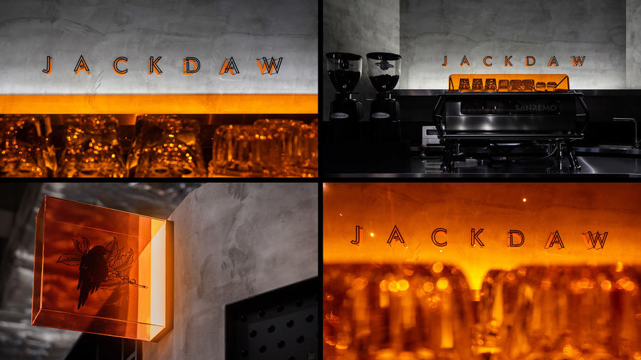
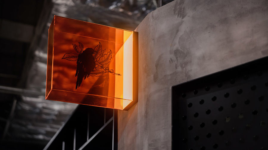
且在整個書店內,只有包裹咖啡空間的外殼是采用全黑的材板作設計,如披上了一層神秘的外衣。雀,是品牌故事的主角,一只“寒鴉”停息于結有咖啡果實的枝葉上。設計師抓取了這個品牌標志的視覺特征,將寒鴉與咖啡枝葉圖形分開,以電動趟門的形式將兩扇玻璃重疊安裝。實現寒鴉與咖啡枝葉重疊的動態(tài)效果。據咖啡師說:“有些客人是喝完咖啡要離開時,才發(fā)現這個創(chuàng)意,他們會退回店內,再次觀看標志重合的效果……引起了他們的好奇。
”In the entire bookstore space, only the envelope of the coffee shop utilizes all-black panels, which seem to add a mysterious touch to it. “Que”, referring to “bird” in Chinese, is the protagonist of the brand’s story, with its logo showcasing a jackdaw standing on a branch with coffee berries. The designers extracted visual elements of the brand’s logo, and creatively separated the patterns of the “jackdaw” and the “coffee tree branch” on the two glass sheets of the automatic sliding door. When overlapped, the glass sheets vividly present the complete image of the brand logo. “Some customers didn’t find this creative detail until they finished their coffee and were about to leave. When discovering it, they would go back into the shop and appreciate the overlapping visual effects,” a barista said.
▼咖啡空間入口
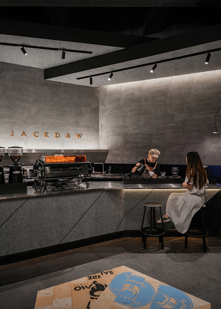
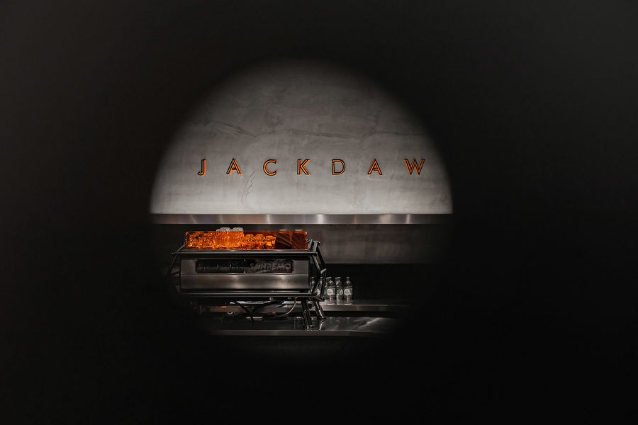
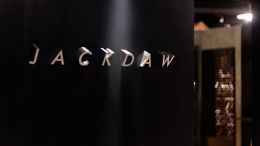
吧臺中心的位置是主要的咖啡機,其背后面墻面是品牌的英文字標,運用光與影反相的立體化設計,讓吧臺區(qū)更具儀式感,略帶有咖啡朝圣的感覺。
The central area of the bar counter is occupied by the main coffee maker, and its backdrop wall showcases the brand’s English name. Complemented by golden light and the shadows, the three-dimensional letters add a sense of ritual and a pilgrimage-like atmosphere to the counter area.
▼吧臺
▼多邊形的錯層式天花,形態(tài)如鳥巢
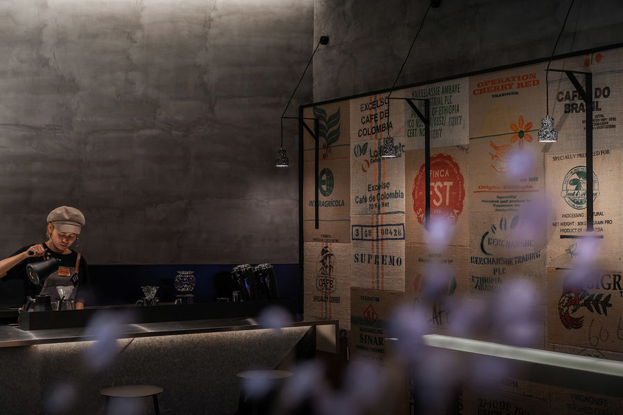
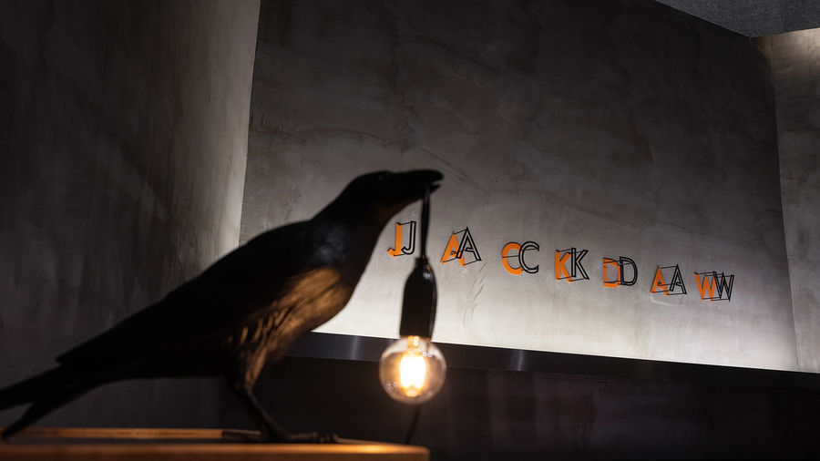
由于書店位置商場內,沒有自然光線進入,設計師便萌生了“在黑暗中發(fā)光”的情景構思,咖啡也像知識一樣散發(fā)光芒,得到知音尋覓,這也契合了寒鴉“喜群棲,常結成喧鬧的小群體”的特性。燈光的作用,除了照亮物體,它的另一種魅力是產生陰影,所以在營造黑暗中發(fā)光的情景時,一個體塊只使用一個方向的光源,且相連的面燈光方向不同,把陰影視為存在的物體去設計。
Situated in a shopping mall, the bookstore has no natural light. This inspired the designers to create spatial scenes based on the concept of “glowing in the dark”. It conveys the idea that coffee can “glow” and illuminate the mind as knowledge do and can gather people together, which responds to the gregarious character of jackdaws. The lighting not only brightens objects, but also produces shadows. As conceiving spatial scenes based on the darkness, the designers decided to illuminate each block with a light source from a single direction, and gave interconnected surfaces different directions of light, so as to subtly “design” shadows in the space.
▼由入口看整個咖啡空間
▼店鋪中的座椅細部
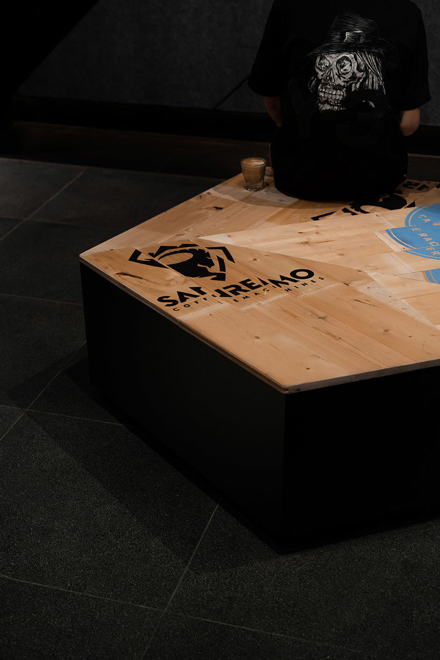
▼店內設有不同的座位形式,可讓小空間喧鬧起來
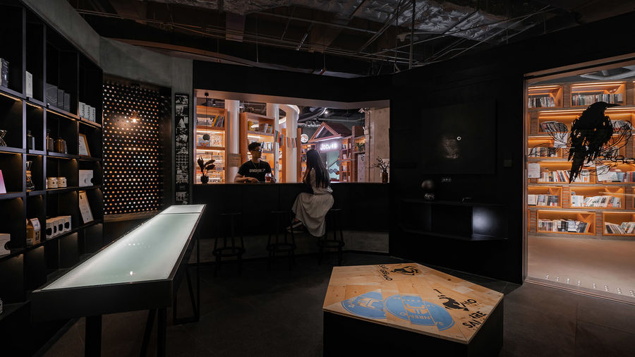
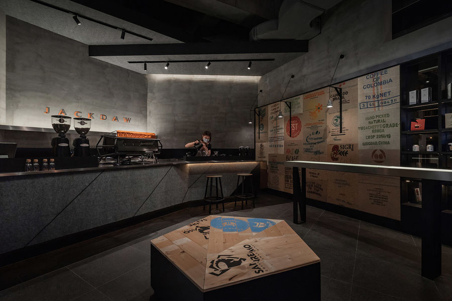
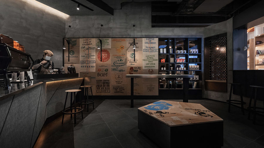
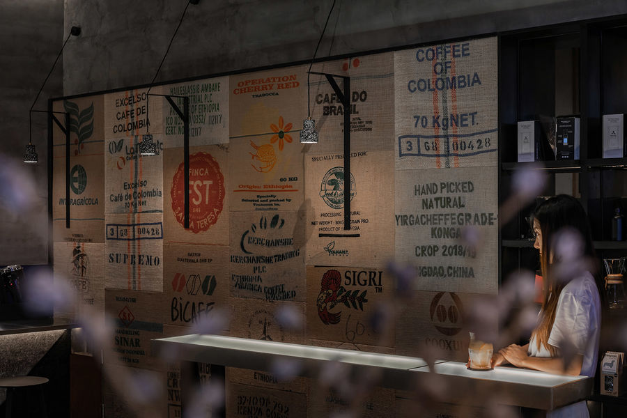
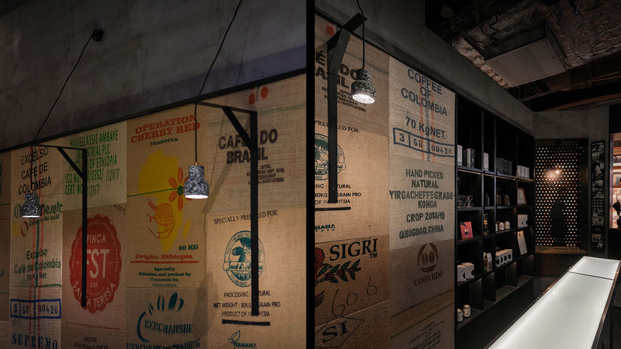
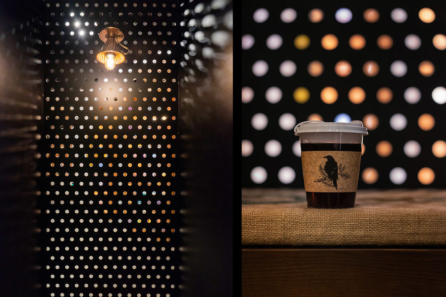
▼由不同產地的咖啡豆包裝麻袋裱裝而成的墻面
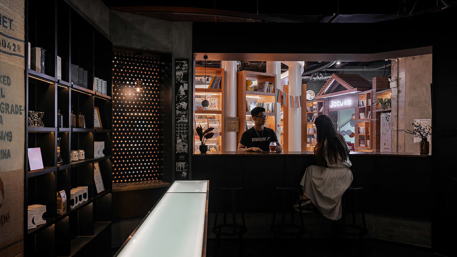
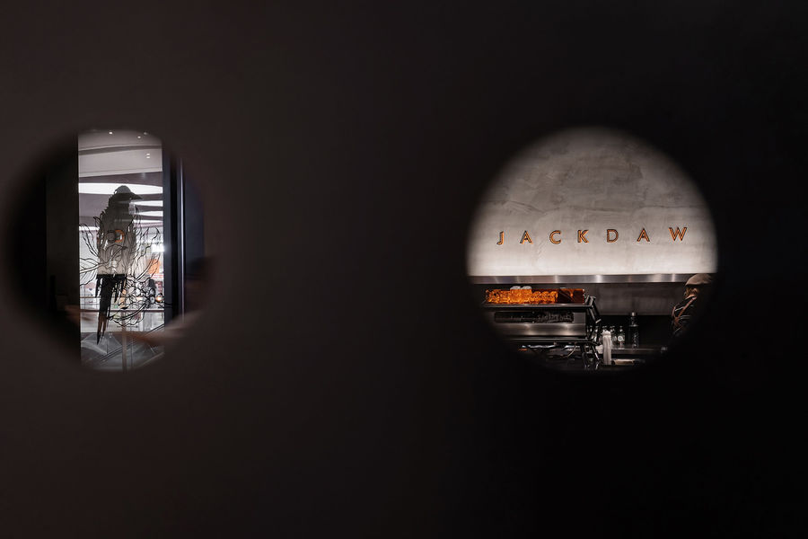
▼沖孔板營造出獨特的光影效果
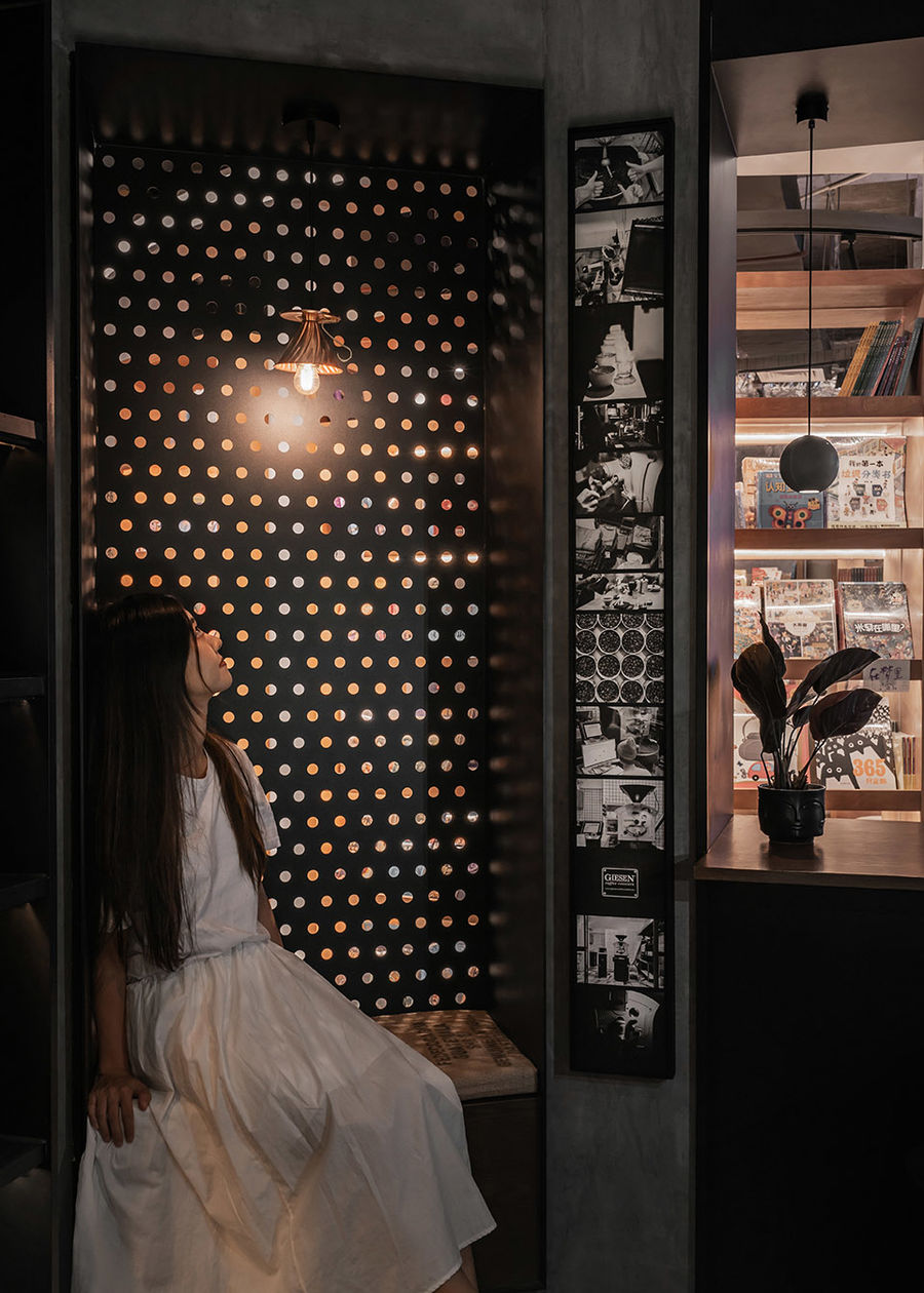
▼從書店透過沖孔板看到的景象
咖啡店從成為城市的第三空間,到作為年輕人的聚集點,甚至成了“社交幣”的一種說法等,我想是:“喝咖啡除了比抽煙、吃飯、玩游戲更容易顯得有姿態(tài)外,咖啡品牌整體對空間設計具有越來越強的個性化追求,使得去哪家咖啡店座座,成為了我們討論的日常……”這種可見的效應讓空間設計成了咖啡品牌和設計師展現構想的舞臺。也成為了人們勇于表達想法,獲得共鳴的場所。
Nowadays, coffee shops and cafe have become a “third space” in cities, as well as a popular socializing destination among young people. The reason is not merely that drinking coffee is more stylish than smoking, dining, playing games and other activities. More importantly, it’s because that coffee-related brands have been seeking more distinctive spatial designs, which have produced a great many engaging destinations. In such a context, spatial design provides a stage for both brands and designers to give full play to creativity, and the coffee spaces also become a venue where people freely express themselves and resonate with others.
▼入口電動門與品牌logo細部

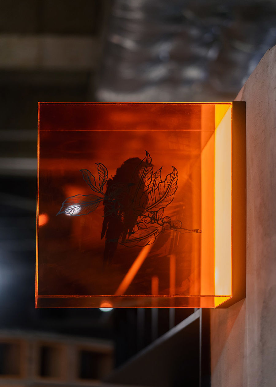
▼壁燈形態(tài)是抽象的鳥,嘴里釣著樹技
▼串聯空間的橙色元素
▼空間解構圖
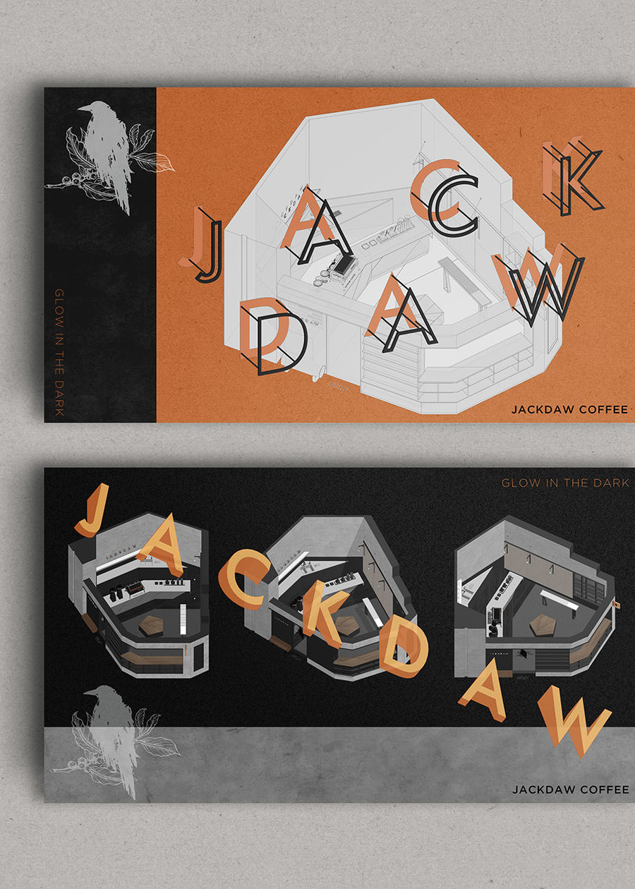
▼以空間的設計元素為店的開業(yè)設計海報
類型:咖啡
空間設計方:三品空間設計事務所
項目設計 & 完成年份:2021-03/2021-05
主創(chuàng)設計:劉嘉培
項目地址:中國廣東省中山市金鷹廣場半點書店內
建筑面積:35平方米
攝影版權:表揚一下
客戶:墨雀咖啡
材料:鐵板、木紋飾面板、水泥涂料


評論(0)